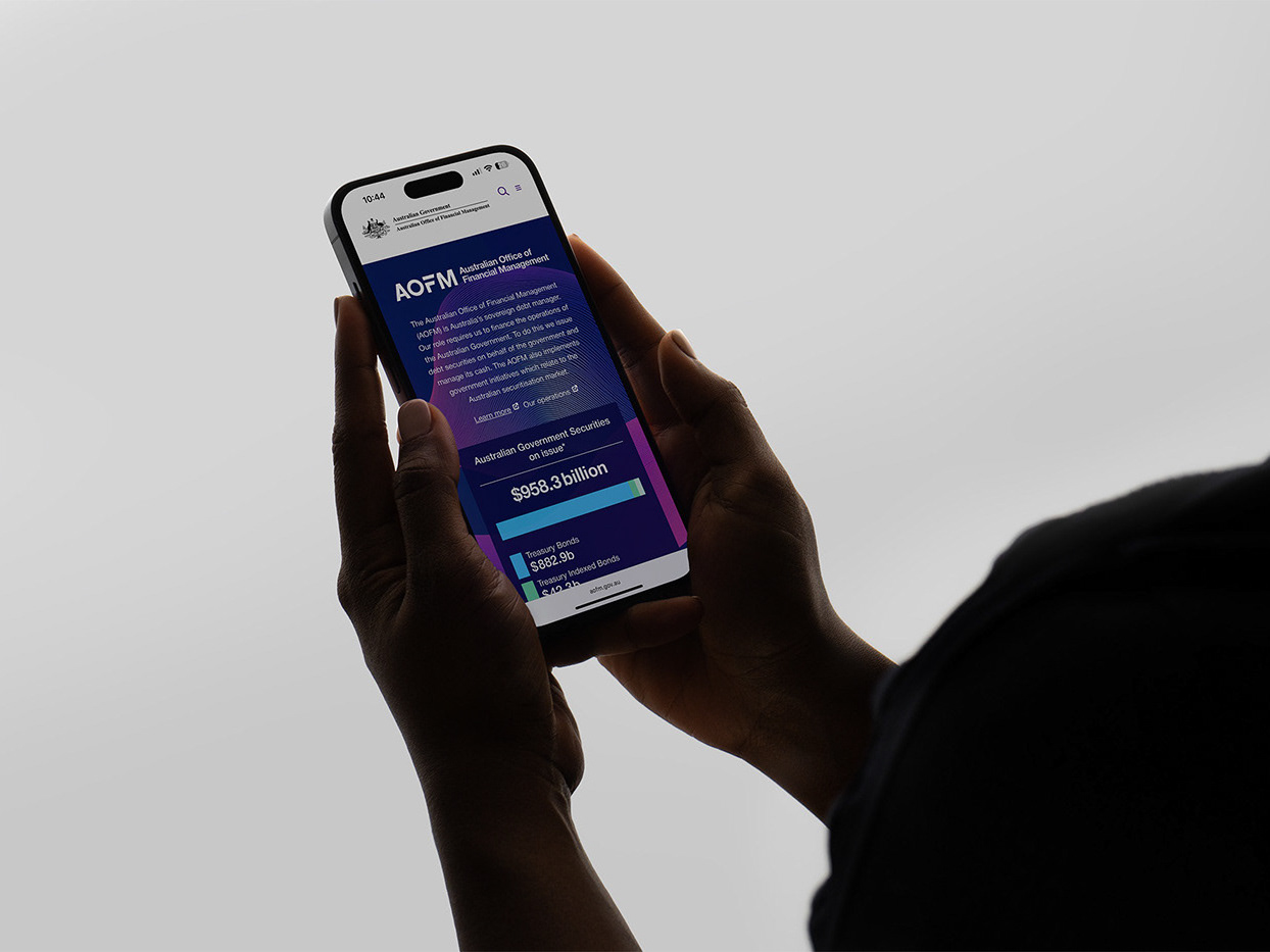
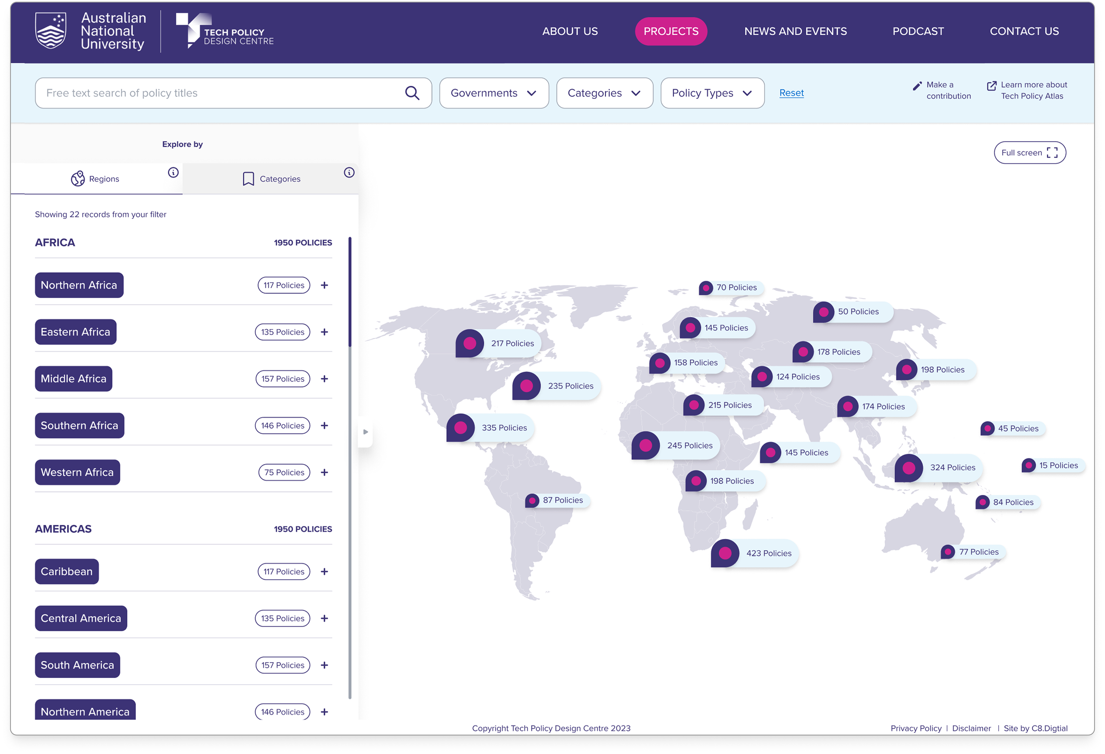
The TPDC's Tech Policy Atlas was transformed into an intuitive platform for navigating complex global regulations. Implementation of layered information architecture and scalable design systems expanded coverage from 36 to 72 jurisdictions and increased policy records from 3,000 to 5,000+, while reducing search time by 40% and boosting user satisfaction by 37%.
_______________________________________________________________________
Transforming Global Tech Policy Access
Revitalised the TPDC Platform, delivered significant improvements by 40% increase in return visitors and 42% reduction in time to find relevant policy information
Team —
With C8.Digital Agency, 1 Digital Director, 1 Senior Product Designer
Role —
Owner & primary designer
Year & Timeline —
2024, 6 weeks
_______________________________________________________________________
_______________________________________________________________________
Background
TPDC (Technology, Policy, and Design Center) needed a digital solution to showcase their research and make complex global technology policies accessible.
Their existing platform lacked user engagement and failed to effectively communicate comparative policy information across countries. The project aimed to create both an organisational website and an interactive Global Tech Policy Atlas that would serve policymakers, researchers, and the public with varying levels of technical expertise.
Why this project
The TPDC project presented a meaningful challenge to transform complex policy information into an accessible digital experience.
With technology policy affecting billions globally, creating a user-friendly platform to navigate these regulations was both technically stimulating and socially impactful. I was drawn to the opportunity to apply UX principles to democratise policy knowledge and build a tool that could influence better tech governance worldwide.
_______________________________________________________________________
The main challenge
How might we transform complex global technology policies into intuitive visual comparisons that serve both policy experts and general audiences while maintaining accuracy and depth?
Balancing depth and accessibility in a tool serving diverse audiences—from policy experts to curious citizens—while visualising complex regulatory relationships across countries. The design needed to simplify intricate policy frameworks without oversimplification, allowing users to make meaningful comparisons without feeling overwhelmed by legal and technical jargon. These activities included:
• Conducted stakeholder interviews with policy experts and potential users
• Created user personas and journey maps for diverse audience segments
• Developed information architecture for complex policy categorisation
• Designed interactive map visualisation with comparative policy analysis features
• Built responsive prototypes and conducted usability testing across devices
• Collaborated with developers to implement the design system
• Established an analytics framework to measure user engagement with policy content
📱 Not optimised for mobile
🤔 Not intuitive to navigate
📰 Complexity of information
🖥️ Not responsive when many information
📋 Not grouped in category
😵💫 Confusing structure impeded policy navigation
_______________________________________________________________________
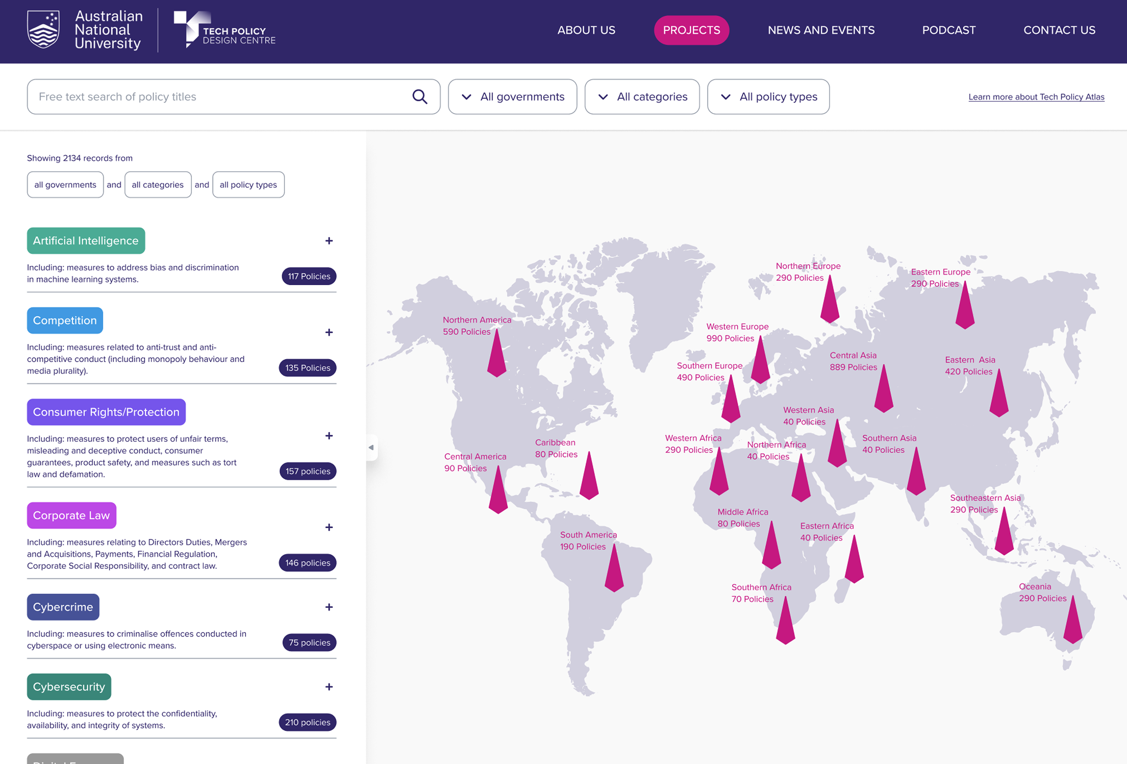
Outcome
The interactive atlas now enables users to compare technology regulations across 60+ countries through an intuitive visualisation system.
Policymakers report using the tool to inform legislative decisions, while researchers leverage it to identify global regulatory patterns, fulfilling our core mission of making technology policy more accessible and actionable.
35% — increase in resource discovery and downloads
42% — reduction in time to find relevant policy information
28% — improvement in mobile engagement metrics
40% — increase in return visitors
4.8/5 Stars 🌟 — from key government and industry stakeholders
4.8/5 Stars 🌟 — from key government and industry stakeholders
_______________________________________________________________________
_______________________________________________________________________
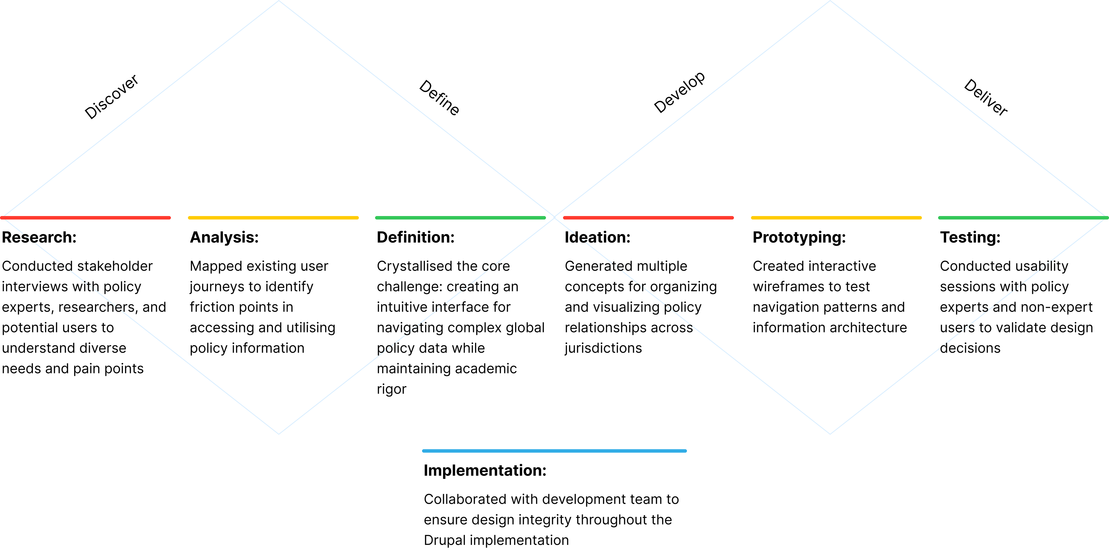
How I got there
My approach to revitalising the TPDC platform followed the Double Diamond methodology, ensuring a comprehensive understanding of the problem space before developing targeted solutions.
_______________________________________________________________________
How I lead
Structured 5-Layer Approach for Rapid Delivery
To meet our tight 6-week timeline, I developed a sequential 5-layer strategy that enabled efficient problem-solving and stakeholder alignment. This lean approach built each phase upon a solid foundation:
1. User Definition:
Clearly identified our target audiences and their specific needs
2. Information Architecture:
Mapped essential products, actions, and content requirements
3. Navigation Framework:
Designed intuitive pathways between pages and content areas
4. Template System:
Created flexible, reusable layouts for a consistent user experience
5. Interaction Design:
Developed UI patterns aligned with the new brand identity and design language
This structured methodology ensured stakeholder alignment at each phase while maintaining momentum toward our delivery deadline.
_______________________________________________________________________
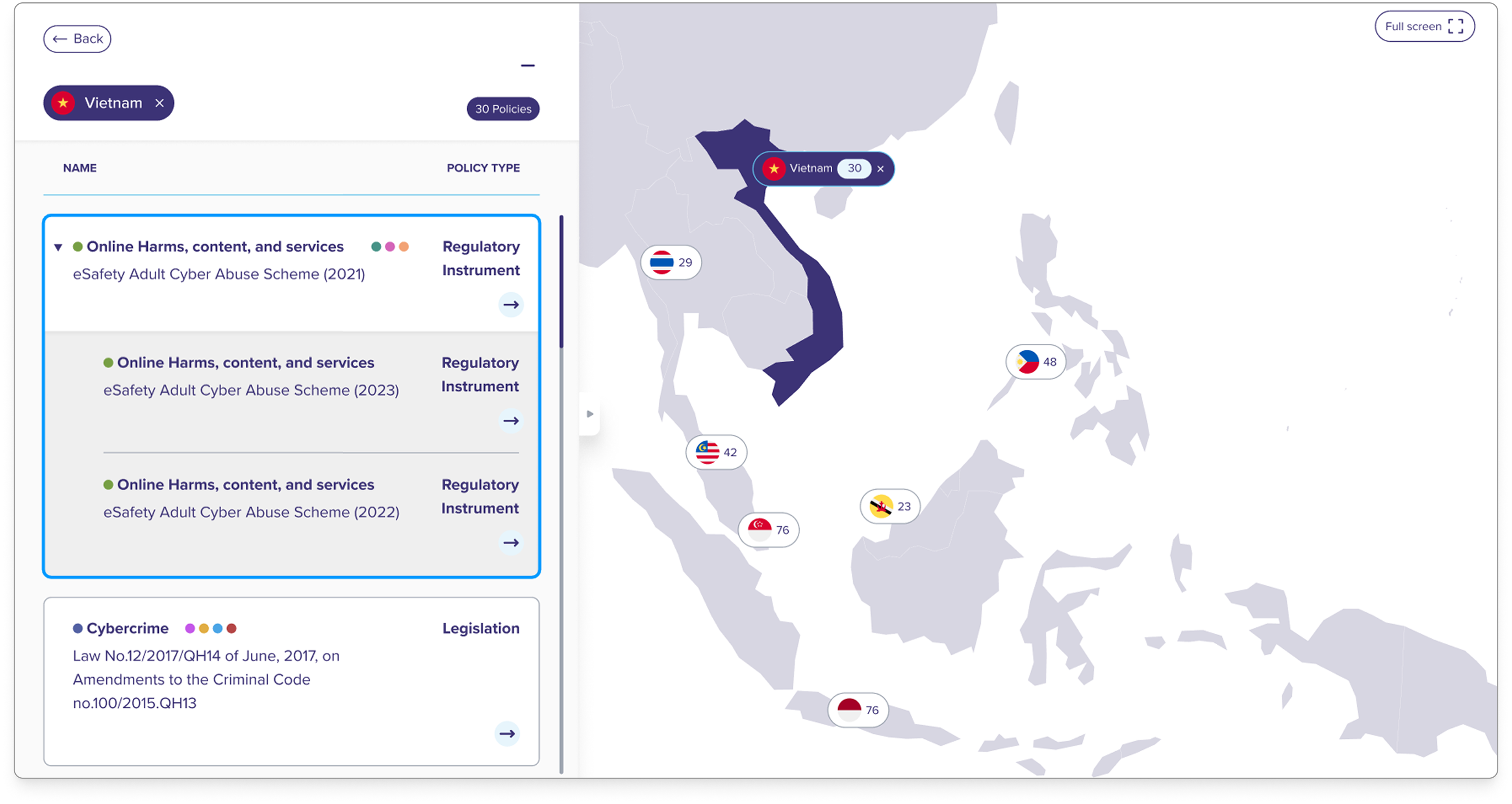
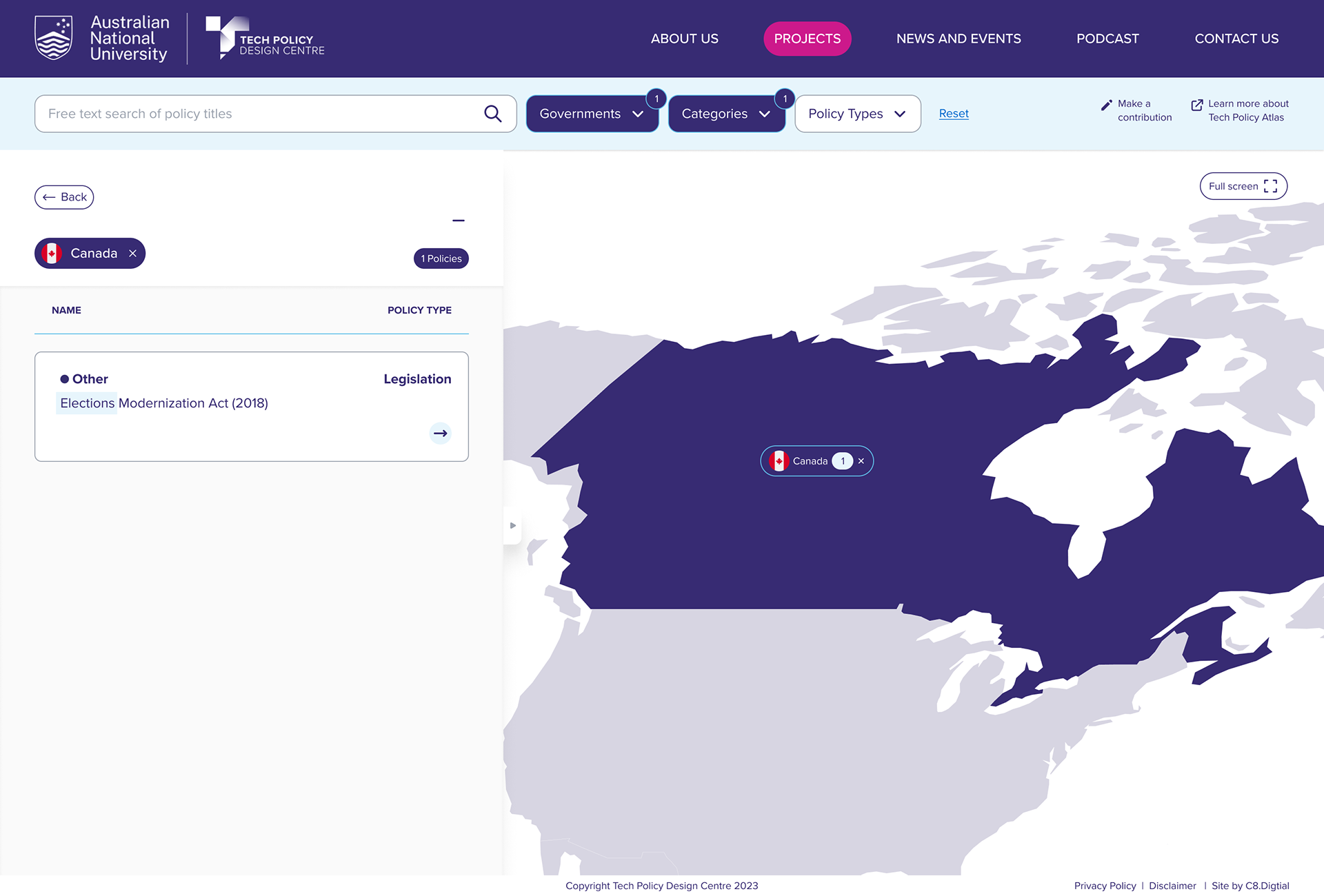
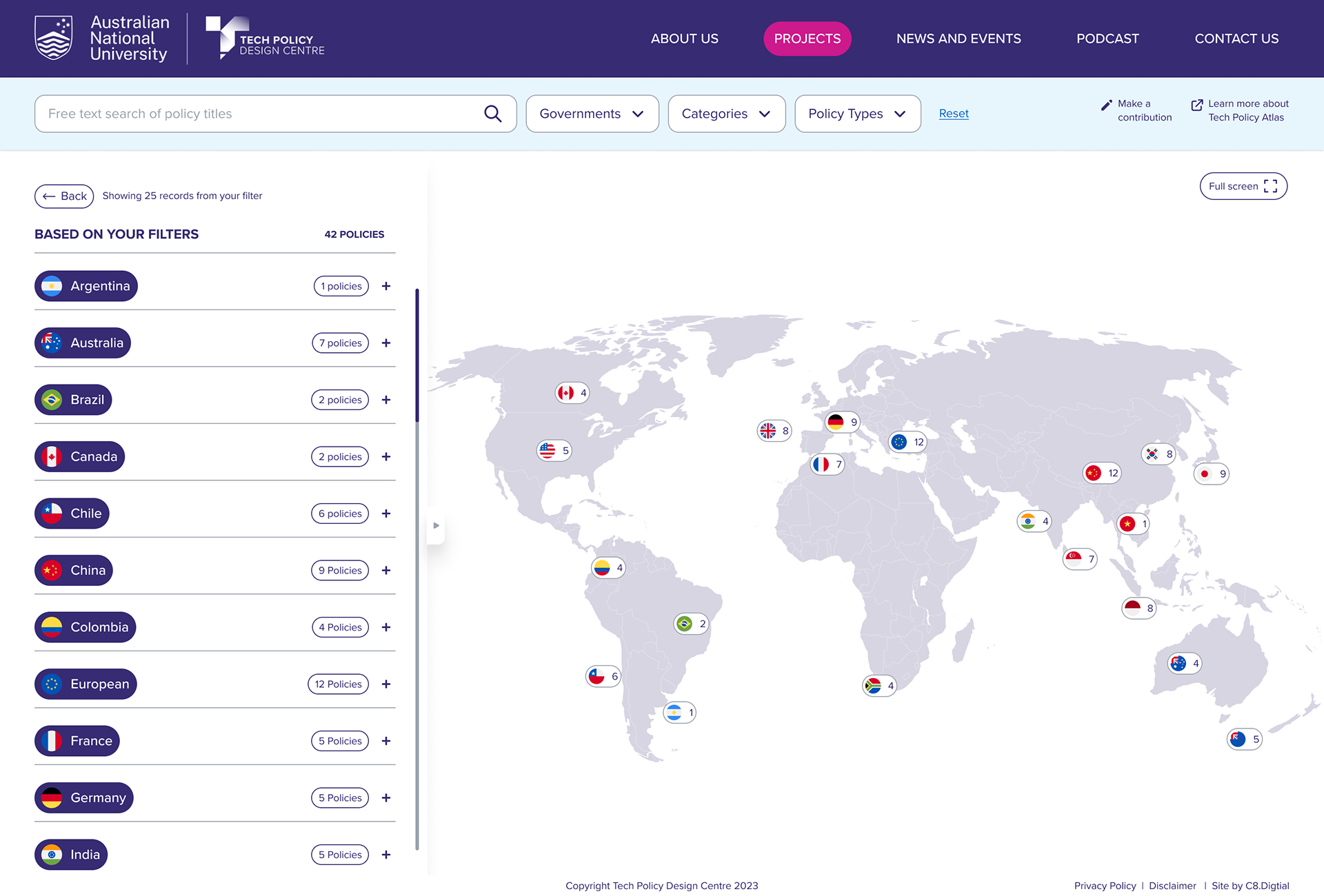
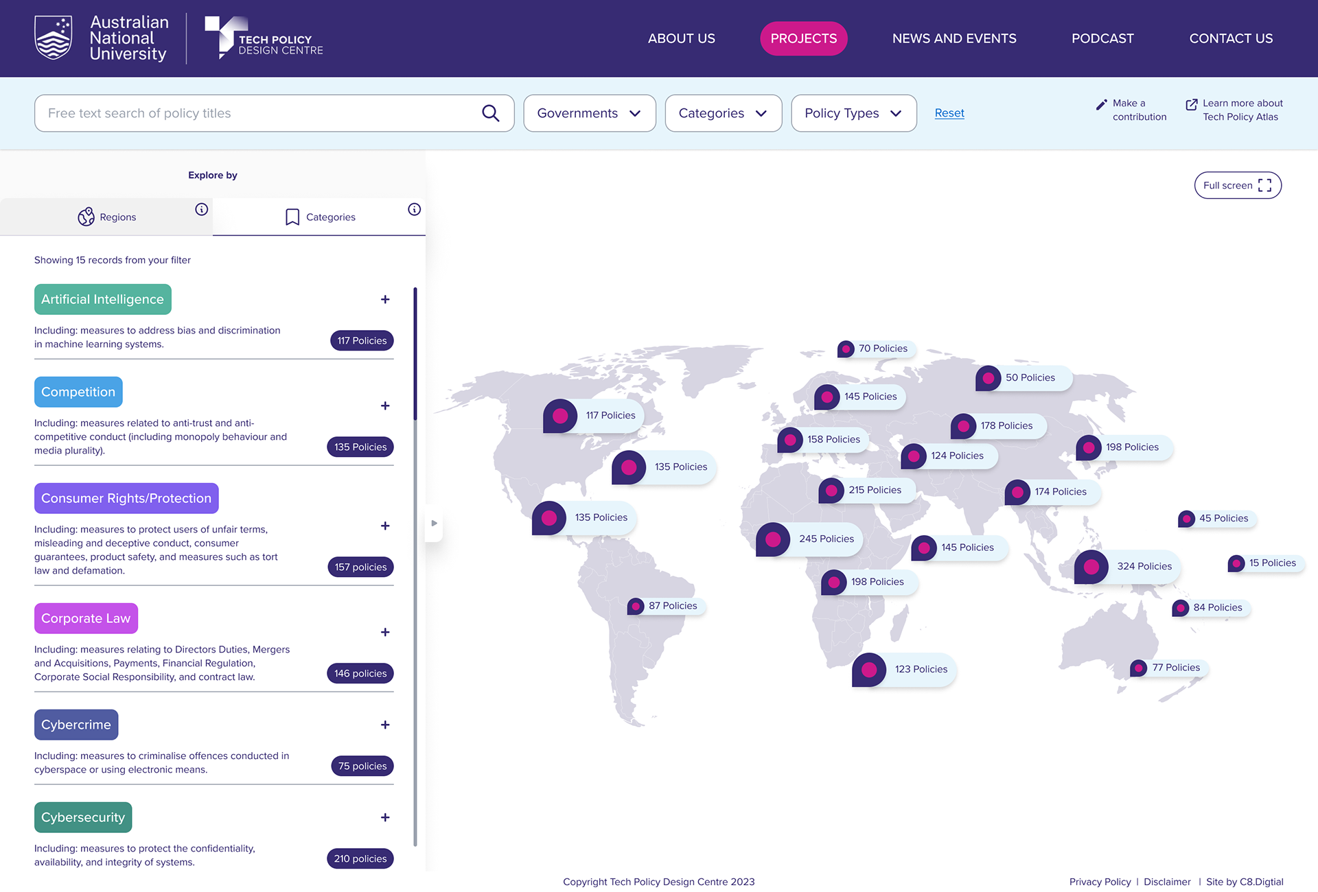
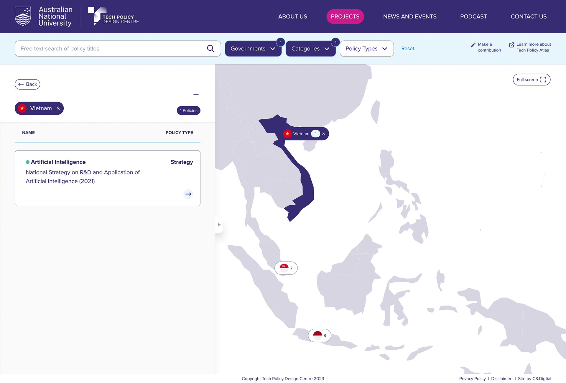
Solution - IA & Nav 1.0
Simple navigation with a clear structure to enhance usability
• Organise datasets visually by regions and policies in a dual-column layout for intuitive navigation
• Implement colour-coded policy categories for enhanced scanability and comprehension
• Validate structure through 3 rounds of IA testing with both internal teams and external users
• Develop wireframes and high-fidelity prototypes based on proven precedents
• Conduct usability testing with 10 participants to gather insights and refine the interface
_______________________________________________________________________
TPDC - Prototype 1.0
_______________________________________________________________________
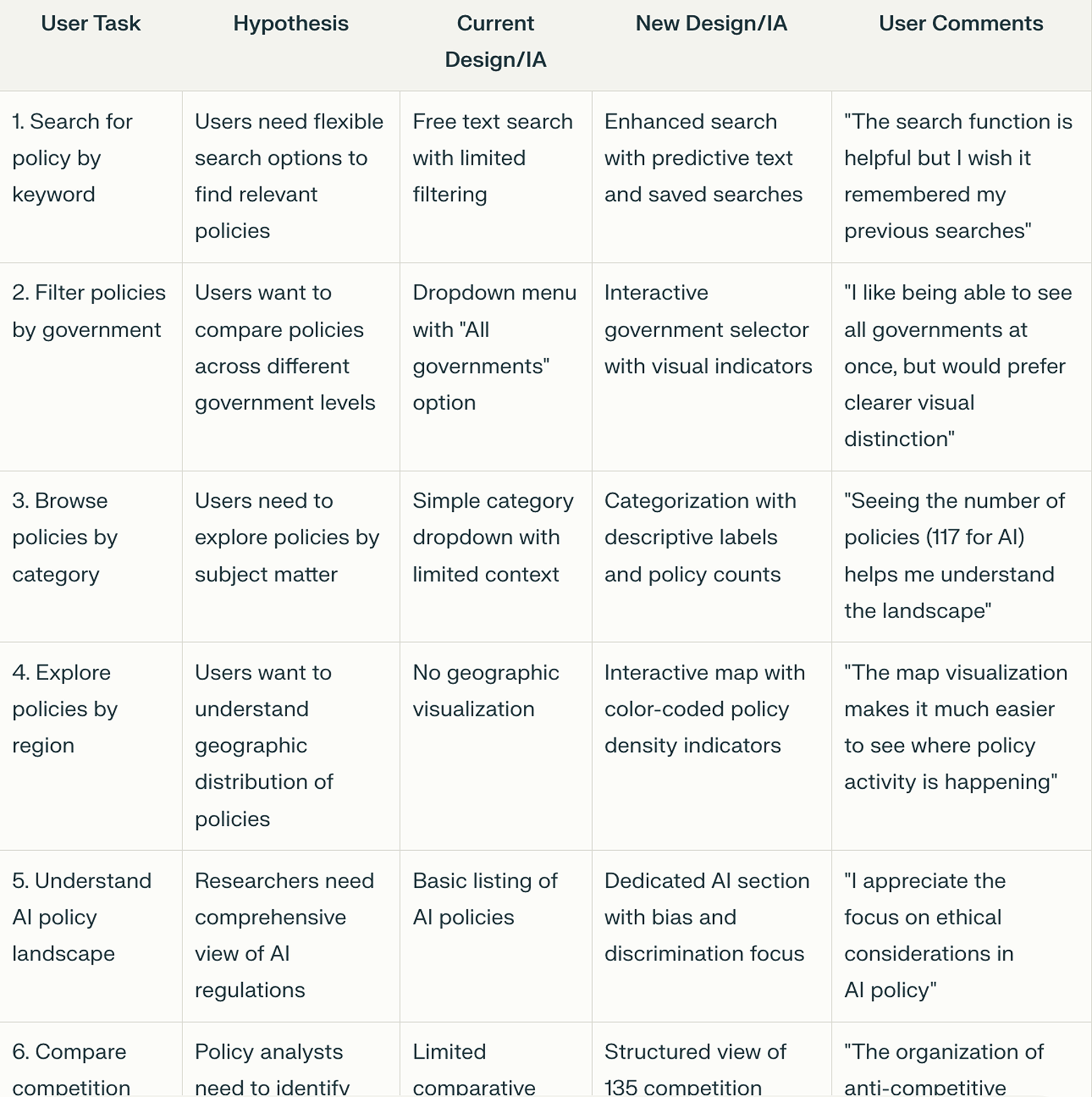
Summary of findings:
Current & New Design IA
Current & New Design IA
_______________________________________________________________________
Solution - page templates & layout
Structured Information Layers for Intuitive Policy Navigation
I developed a multi-layered information architecture that transforms complex policy data into easily digestible content. This approach creates clear pathways through dense information by:
• Organising policies into intuitive categories based on user mental models
• Creating progressive disclosure patterns that reveal details only when needed
• Implementing consistent hierarchies across jurisdictions for easier comparison
• Designing clear visual relationships between related policy elements
This layered structure allows users to quickly find relevant information without being overwhelmed, enabling both broad exploration and targeted research within the same interface.
_______________________________________________________________________
Solution - page templates & layout
Designing for Growth: Scalable Systems for Expanding Content
To accommodate the platform's rapid growth from 36 to 72 jurisdictions and 3,000 to 5,000+ policy records, I implemented a scalable design system with:
• Modular components that maintain consistency while adapting to different content types
• Flexible templates that accommodate varying information density across jurisdictions
• Progressive loading patterns that maintain performance despite increased data volume
• Standardised visualisation tools that work effectively across diverse policy domains
This systematic approach ensures the user experience remains intuitive and responsive even as the platform continues to expand, allowing for future growth without requiring redesign.


_______________________________________________________________________
Reflection
This project challenged me to find the balance between comprehensive policy information and intuitive user experience. The most valuable insights came from:
Prioritising User Context:
Understanding how different stakeholders—from policymakers to researchers—approach policy information shaped crucial design decisions. By mapping these diverse mental models, I created navigation paths that serve multiple user journeys.
Embracing Complexity Thoughtfully:
Rather than oversimplifying the inherently complex nature of global policy, I focused on creating layers of progressive disclosure. This approach respects both expert and novice users by making information accessible without sacrificing depth.
Learning Through Iteration:
The most effective solutions emerged through rapid prototyping and testing with actual users. Several early assumptions about how users would navigate between jurisdictions proved incorrect, leading to significant improvements in the final design.
Cross-Functional Collaboration:
Working closely with policy experts and developers throughout the process ensured that design decisions supported both content accuracy and technical feasibility. This collaboration was essential for translating complex requirements into coherent user experiences.
—
This project reinforced my belief that good design can make even the most complex information accessible, ultimately supporting better decision-making on issues that affect millions of people worldwide.
_______________________________________________________________________
"This designer's work on the Tech Policy Atlas was transformative. They turned our complex database into an intuitive, powerful tool that's now indispensable for policymakers and researchers worldwide. Their approach not only improved usability but also allowed us to double our coverage without compromising on user experience. This redesign has significantly amplified our impact on global tech policy."
— Professor Johanna Weaver, Director, Tech Policy Design Centre
_______________________________________________________________________