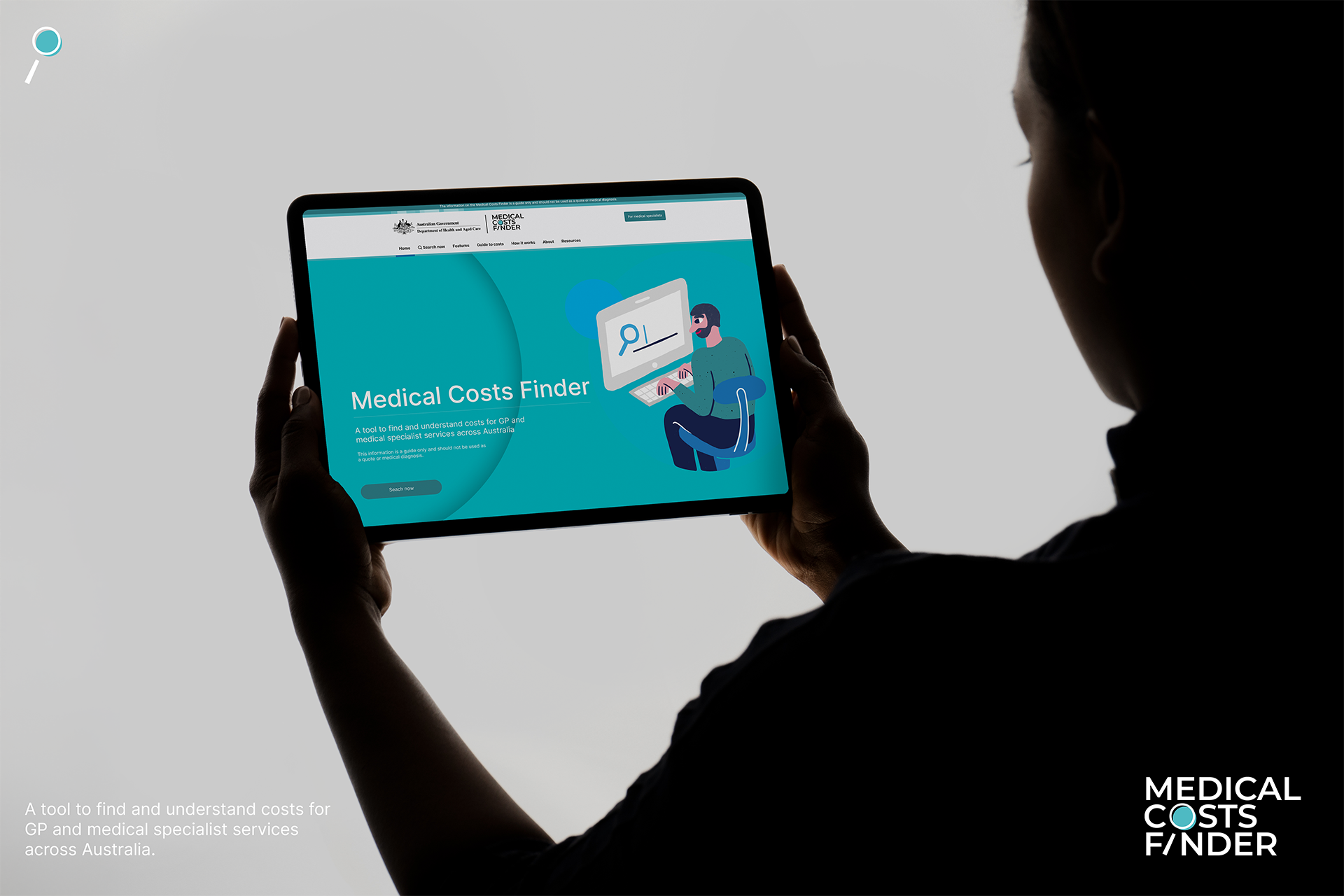
Medical Costs Finder Platform
Year 2023
Company: Department of Health, Disability and Ageing
Company: Department of Health, Disability and Ageing
Team
Design Lead - Collaborated with Product Manager, Creative Director, Project Managers, and Development Team
Project Overview
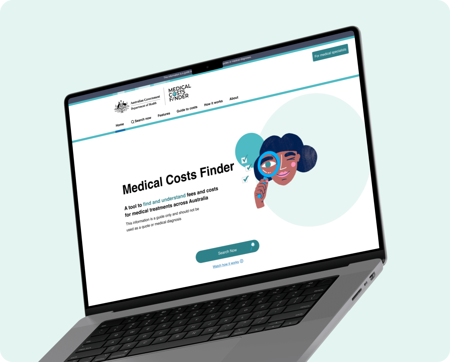
Leading the complete redesign of the Medical Costs Finder, an online government resource that provides transparent information on medical procedure costs across Australia. This critical healthcare tool serves patients seeking to understand expenses for both inpatient and outpatient services, transforming complex government data into accessible, user-friendly information that empowers informed healthcare decisions.
The platform addresses a fundamental gap in healthcare transparency, helping patients navigate the complexities of medical costs with confidence while meeting stringent government accessibility and compliance requirements.
Key Objectives
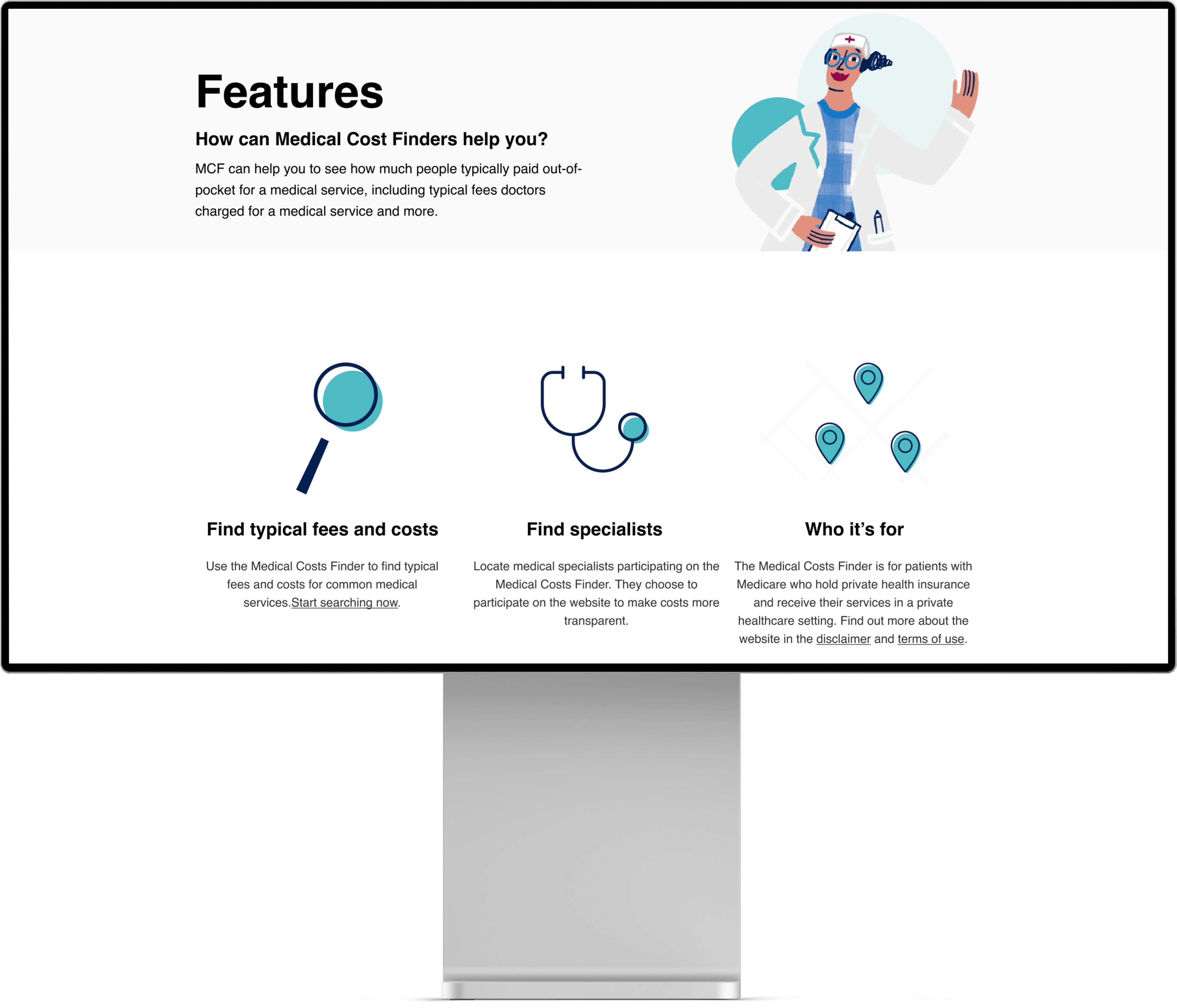
Comprehensive Information Hub
Deliver detailed, accurate data on medical procedures and costs while empowering patients with knowledge for informed healthcare decisions.
Deliver detailed, accurate data on medical procedures and costs while empowering patients with knowledge for informed healthcare decisions.
Simplified Complex Information
Transform intricate medical and financial data into user-friendly formats, increasing accessibility and understanding for all users regardless of their medical knowledge.
Transform intricate medical and financial data into user-friendly formats, increasing accessibility and understanding for all users regardless of their medical knowledge.
End-to-End Patient Journey
Guide users seamlessly from initial research to post-procedure care, enhancing patient preparedness and overall healthcare experience.
Guide users seamlessly from initial research to post-procedure care, enhancing patient preparedness and overall healthcare experience.
Tasks
• User Research & Analysis
• Information Architecture
• User Experience Design
• User Interface Design
• Brand Identity Development
• Journey Mapping
• User Flow Optimisation
• Interactive Prototyping
• Usability Testing
• Stakeholder Management
• Cross-functional Collaboration
• Design System Development
Kickoff meeting
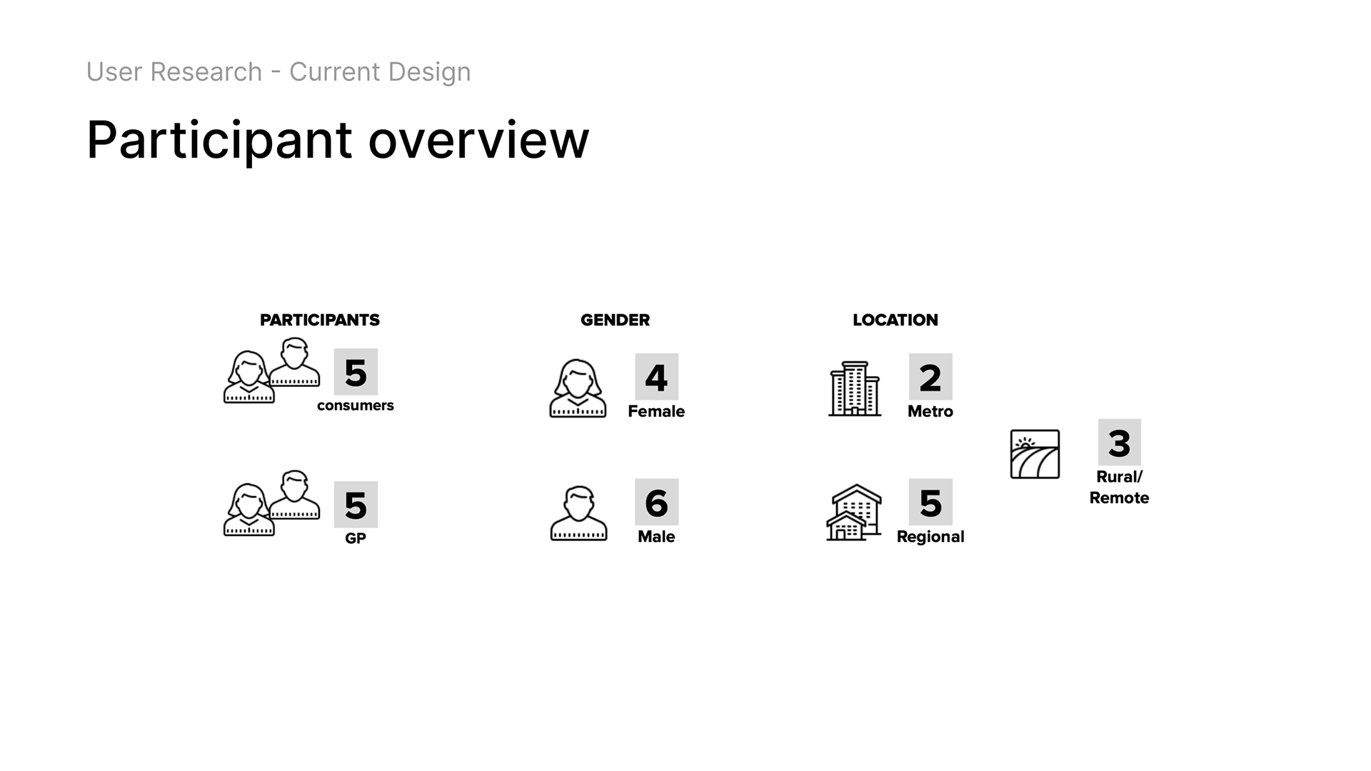
Initiated the project with comprehensive stakeholder alignment sessions, gathering critical insights from healthcare providers, insurance representatives, and government officials. Key questions addressed included: How do patients currently navigate medical cost information? What are the existing pain points in government healthcare resources? Are there regulatory requirements that must be considered? What technical constraints exist within government systems?
After synthesising this information with extensive user research data, I developed a comprehensive project framework outlining the core challenge: the lack of transparent, accessible medical cost information was creating barriers for patients making healthcare decisions.
I established a collaborative three-way partnership between users, client stakeholders, and the development team, ensuring our solution would address real user needs while remaining technically feasible and meeting business objectives. This foundation enabled us to work within an agile methodology, facilitating continuous improvement and adaptation throughout the design process.
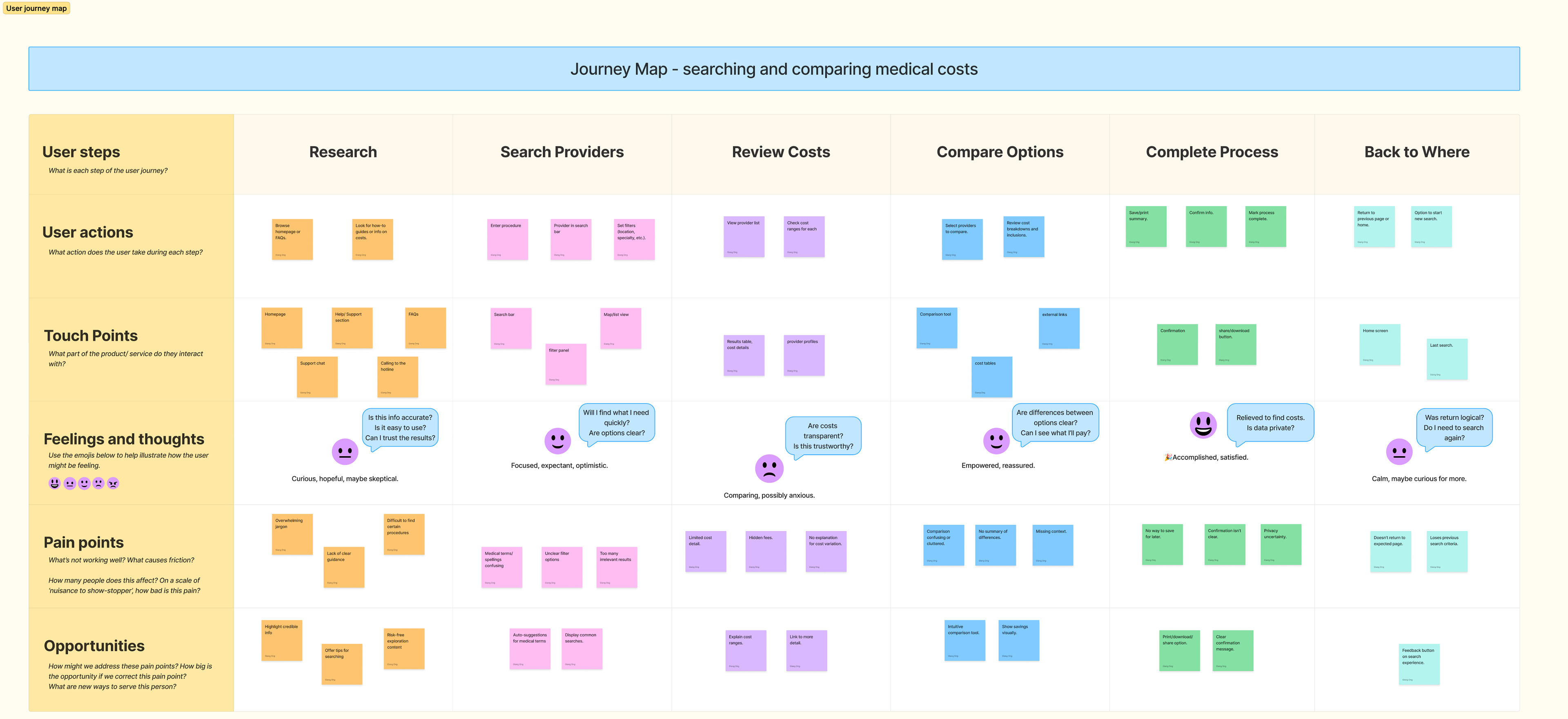
— Journey Maps
Through comprehensive journey mapping, I gained deep insights into users' specific needs, motivations, and frustrations when researching medical procedures. The maps revealed critical emotional touchpoints—particularly the anxiety patients experience with unfamiliar medical terminology and fragmented information sources.
By mapping goals and opportunities against each journey stage, I identified precise moments where targeted improvements could transform negative experiences into empowering ones. Users needed not just information, but confidence throughout their healthcare decision-making process.
These insights became the foundation for developing solutions that would guide users from initial research anxiety to confident decision-making, ensuring every interaction built trust and reduced cognitive burden.
— User Flow
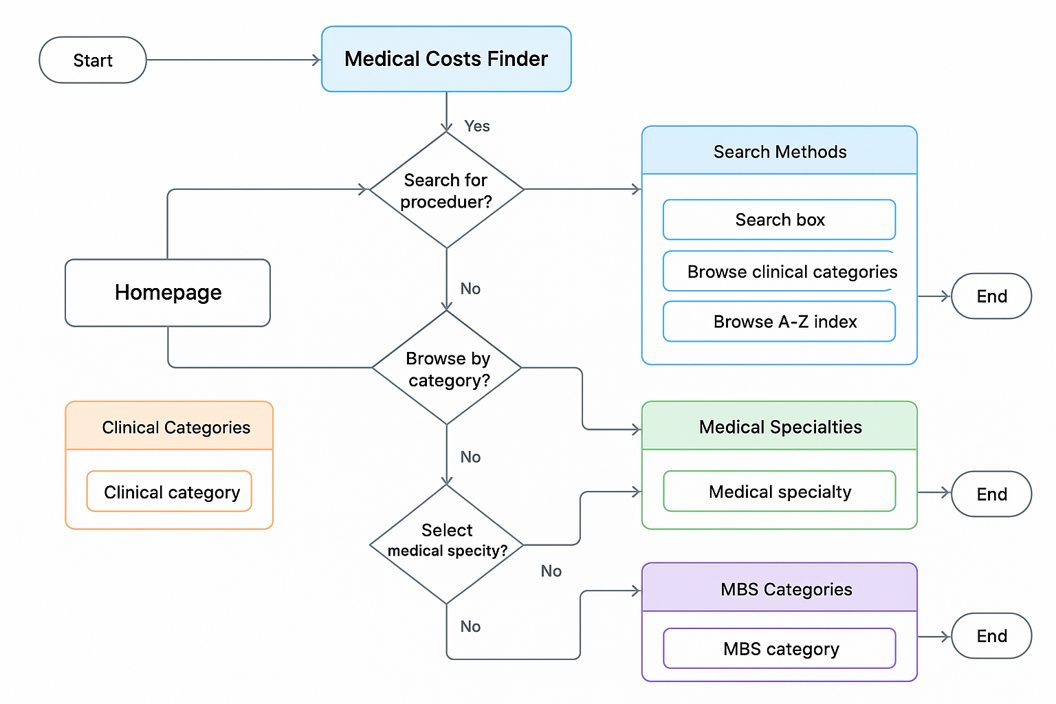
Analysed the existing user flows for searching medical procedures, accessing cost information, and navigating between different service types in the current platform. This analysis helped identify critical steps required from both business and user perspectives, including areas where users encountered friction or dropped off entirely.
The flow mapping revealed how users naturally expected to progress from general inquiry to specific cost information, highlighting mismatches between user mental models and the existing system architecture. I identified key opportunities where streamlined pathways could eliminate unnecessary steps and reduce cognitive load, particularly around specialist searches and procedure comparisons.
This analysis informed how the optimised user flows would integrate into the redesigned platform architecture, ensuring seamless navigation that aligned with user expectations while meeting government data presentation requirements.
— Analysed Flow and Screens
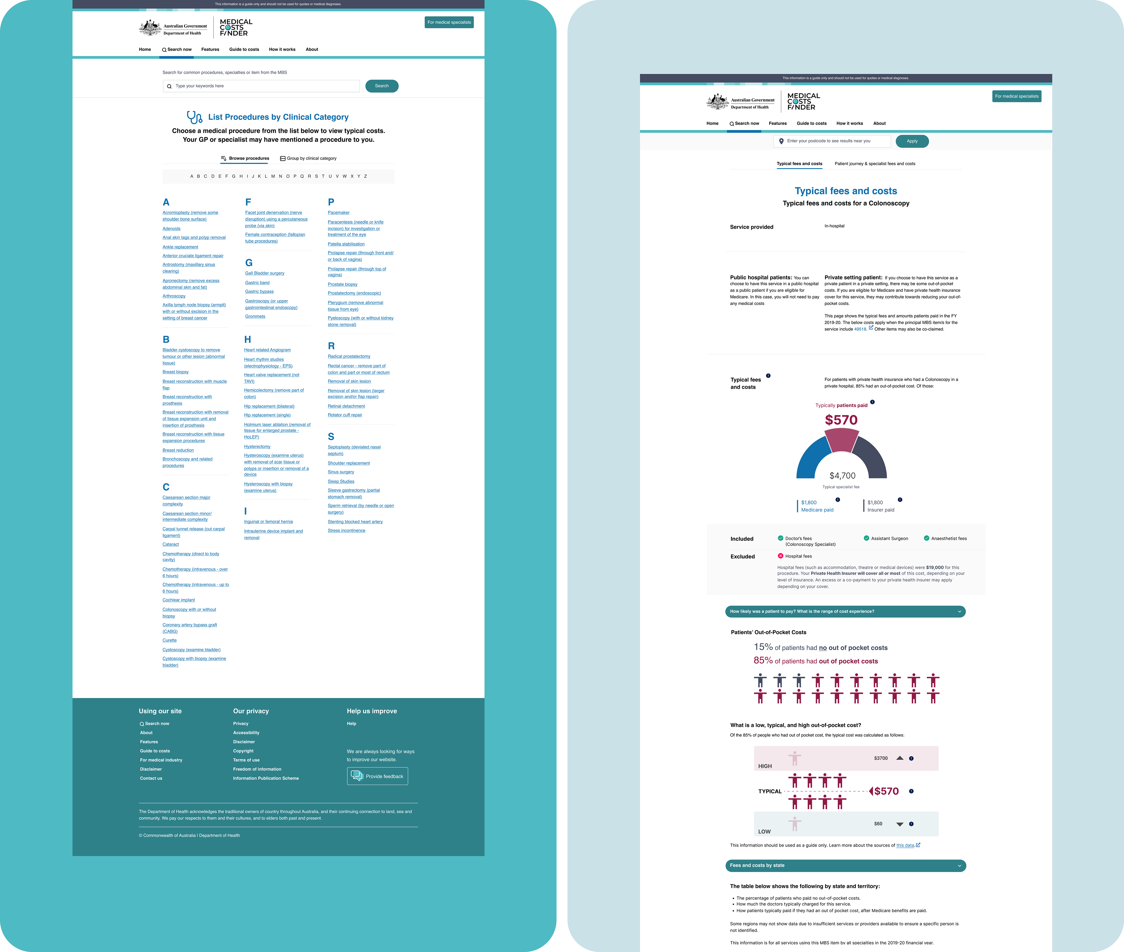
I needed to understand how the entire Medical Costs Finder platform functioned and its connection across all user journeys, including how the existing UX interactions guided users through their healthcare cost research process. I carefully analyzed the current information architecture to make decisive decisions on where to implement streamlined search functionality, simplified terminology explanations, and intuitive navigation pathways.
Through detailed screen analysis and user flow mapping, I identified optimal placement for key improvements: contextual help tooltips, specialty-based search options, and guided cost comparison features. I created rough sketches exploring different approaches and moved quickly to the wireframing stage, working within tight government project timelines to produce initial design concepts for stakeholder review.
This systematic analysis ensured that new features would integrate seamlessly with existing government data structures while dramatically improving the user experience for patients seeking medical cost information.
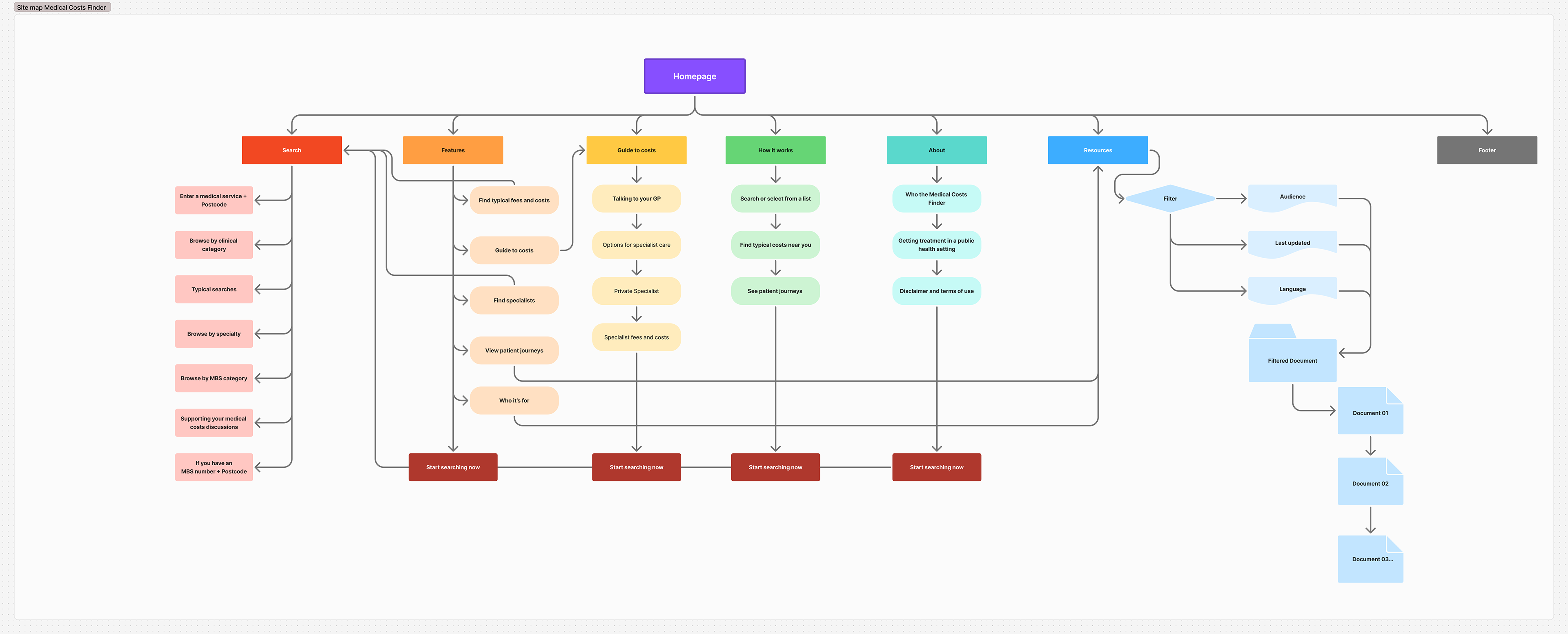
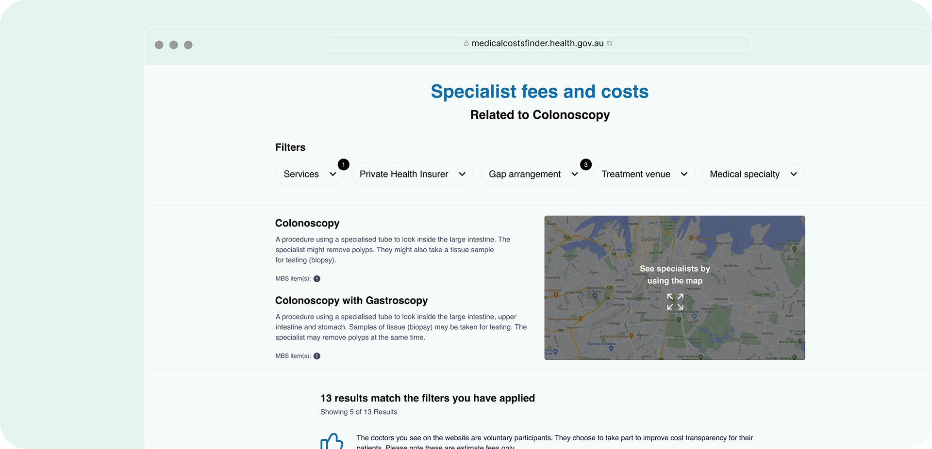
— Information Architecture & Indexation
Based on user research insights and flow analysis, I developed a streamlined information architecture that addressed the core navigation problems identified in the discovery phase. The new site map eliminated competing search pathways and established a clear hierarchy that matched users' mental models for finding medical cost information.
The restructured architecture introduced logical groupings for different user entry points, whether searching by procedure, specialty, or location, while maintaining comprehensive government data requirements. I simplified the navigation depth, reducing the number of clicks needed to access critical cost information and ensuring that users could easily understand their current location within the platform.
This new structure formed the foundation for an intuitive wayfinding experience, allowing patients to confidently navigate from initial inquiry to detailed cost comparisons without encountering the confusion and dead ends that plagued the original platform.
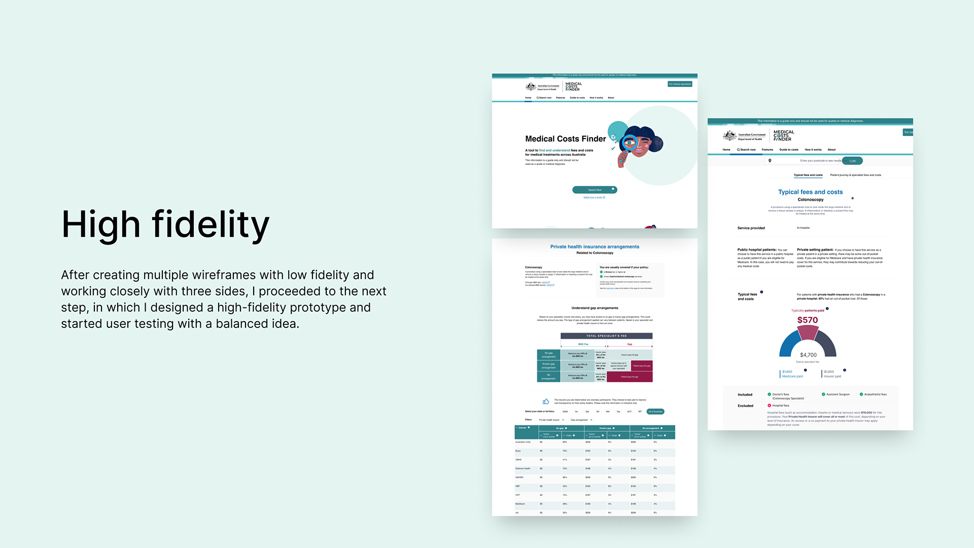
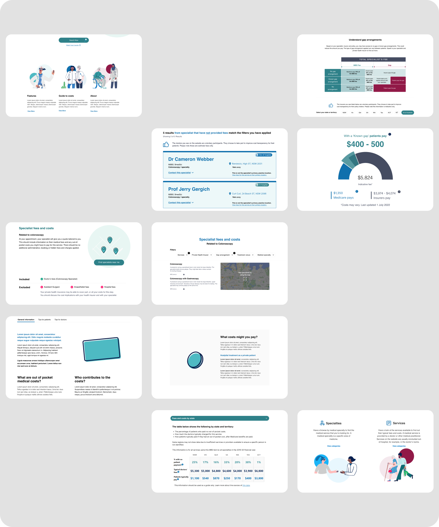
— Low fidelity
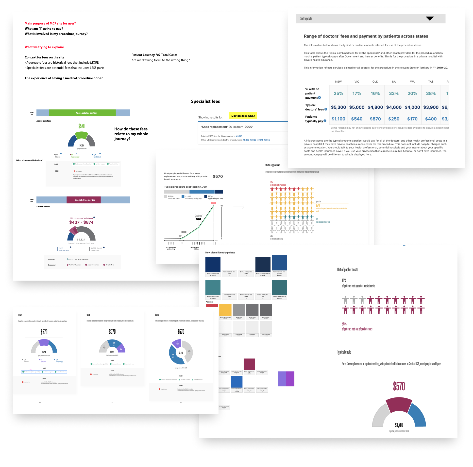
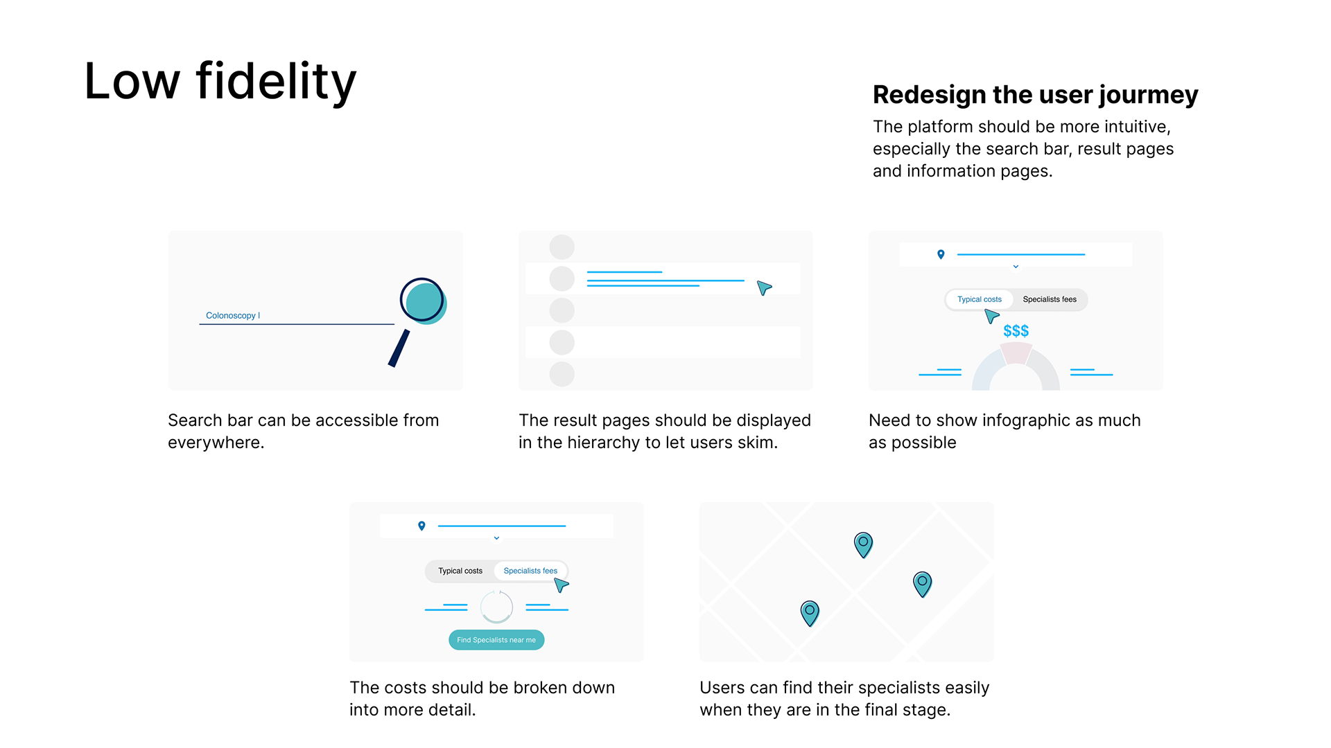
Working within tight government project timelines, I rapidly translated the new site map into low-fidelity wireframes that explored multiple approaches to the core user challenges. These initial concepts aimed to simplify the overwhelming homepage by creating a single, prominent search entry point and establishing a clear visual hierarchy for different user pathways.
The wireframes tested various layouts for presenting complex medical cost data in digestible formats, experimenting with progressive disclosure techniques to reveal information based on user needs. I explored different approaches for contextual help integration, ensuring that medical terminology wouldn't create barriers for users unfamiliar with MBS items.
These low-fidelity explorations allowed rapid iteration and stakeholder feedback before investing in detailed design work. The concepts demonstrated how streamlined navigation, accessible language, and intuitive information architecture could transform the platform from a confusing government database into an empowering healthcare decision-making tool.
— Deliver Stage
Ensuring Success Through Implementation and Validation
The delivery phase focused on transforming design concepts into a fully functional product that met user needs and business objectives.
Validating Through User Feedback
After receiving stakeholder approval on the final design, I implemented a systematic validation approach:
• Conducted usability testing with representative users
• Collected qualitative feedback on the streamlined experience
• Established baseline metrics for ongoing performance monitoring
The results were extremely positive: users reported clear understanding of how to achieve their goals, and the clean, engaging design received high marks for usability and visual appeal.
Seamless Development Handoff
To ensure the design was implemented with fidelity, I:
• Created detailed specifications and interaction documentation
• Maintained close collaboration with developers throughout the build process
• Conducted regular review sessions to address implementation questions
• Provided guidance on accessibility requirements and edge cases
This collaborative approach with the development team ensured that the final Medical Costs Finder website accurately reflected the approved designs while meeting technical requirements.
The successful delivery resulted in a platform that effectively balanced comprehensive medical cost information with an intuitive, accessible user experience—fulfilling both the business goals and addressing the user pain points identified earlier in the process.
_______________________________________________________________________
— Outcome
The redesigned Medical Costs Finder has delivered exceptional results that demonstrate both user value and business success:
Quantifiable Success
• High Traffic Volume: Over 95,000 monthly visitors accessing healthcare cost information
• Strong Engagement: Average visit duration exceeding 4 minutes, indicating meaningful user interaction
• Consistent Growth: Steadily increasing visitor numbers showing sustained relevance and value
• Improved Business Metrics: Significant enhancement of key performance indicators
Team Achievement
This success reflects the collaborative effort of a dedicated team bringing different expertise to create a solution that genuinely serves user needs. The platform now effectively fulfils its mission of making healthcare costs transparent and accessible.
Community Impact
Beyond metrics, the most significant achievement is creating a resource that empowers everyday people to make informed healthcare decisions. The platform now serves as a valuable community asset, helping users navigate the complexities of medical costs with confidence.
This project demonstrates how thoughtful user experience design can transform a previously confusing government resource into an intuitive tool that delivers measurable value to both users and stakeholders.