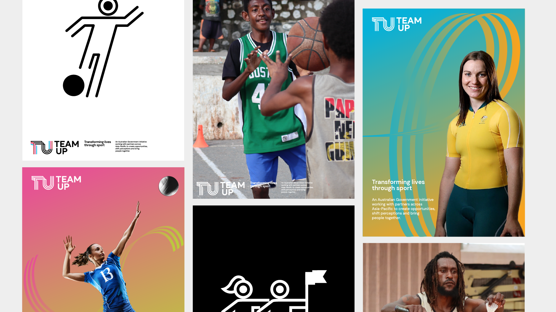
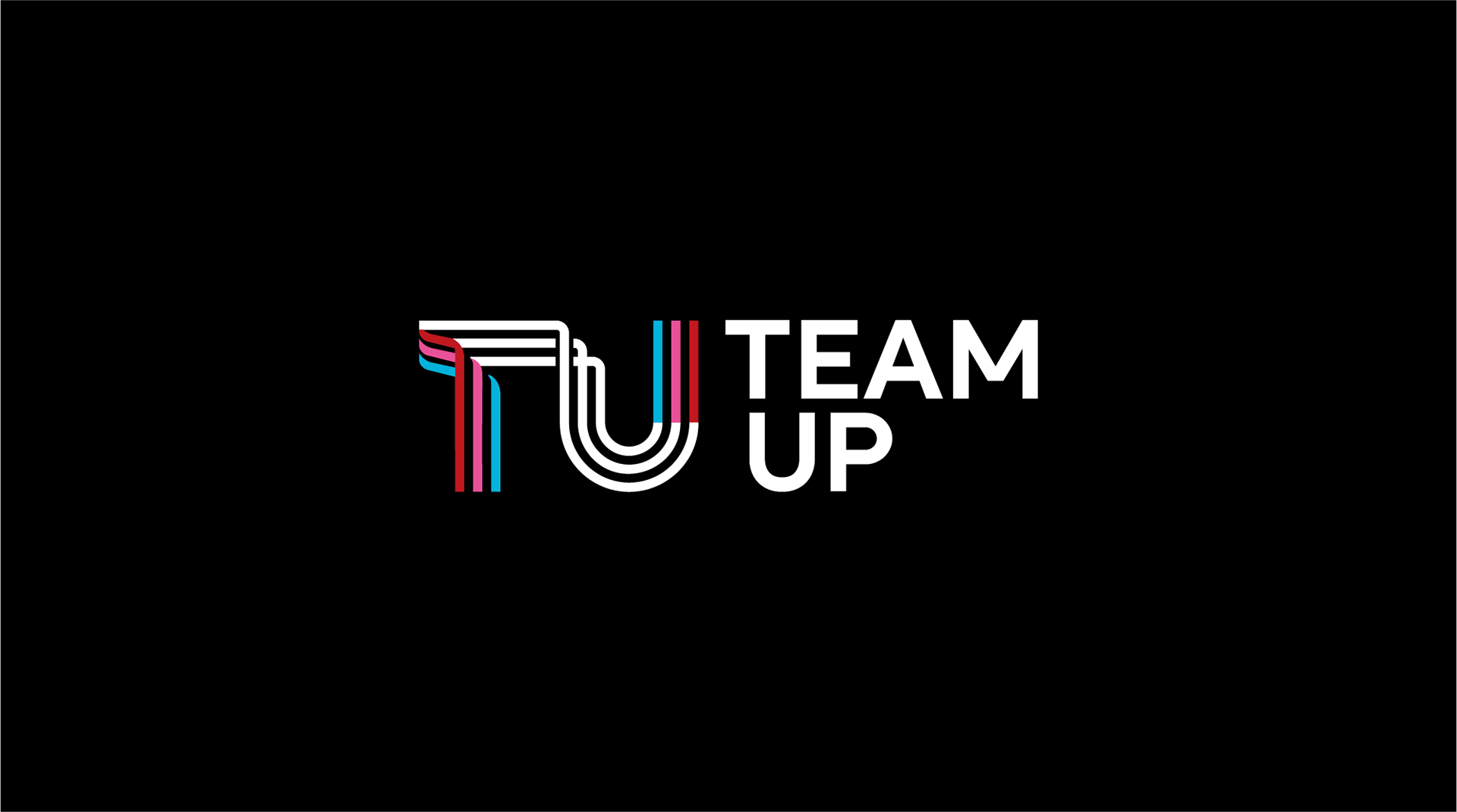
TEAM UP — Australia
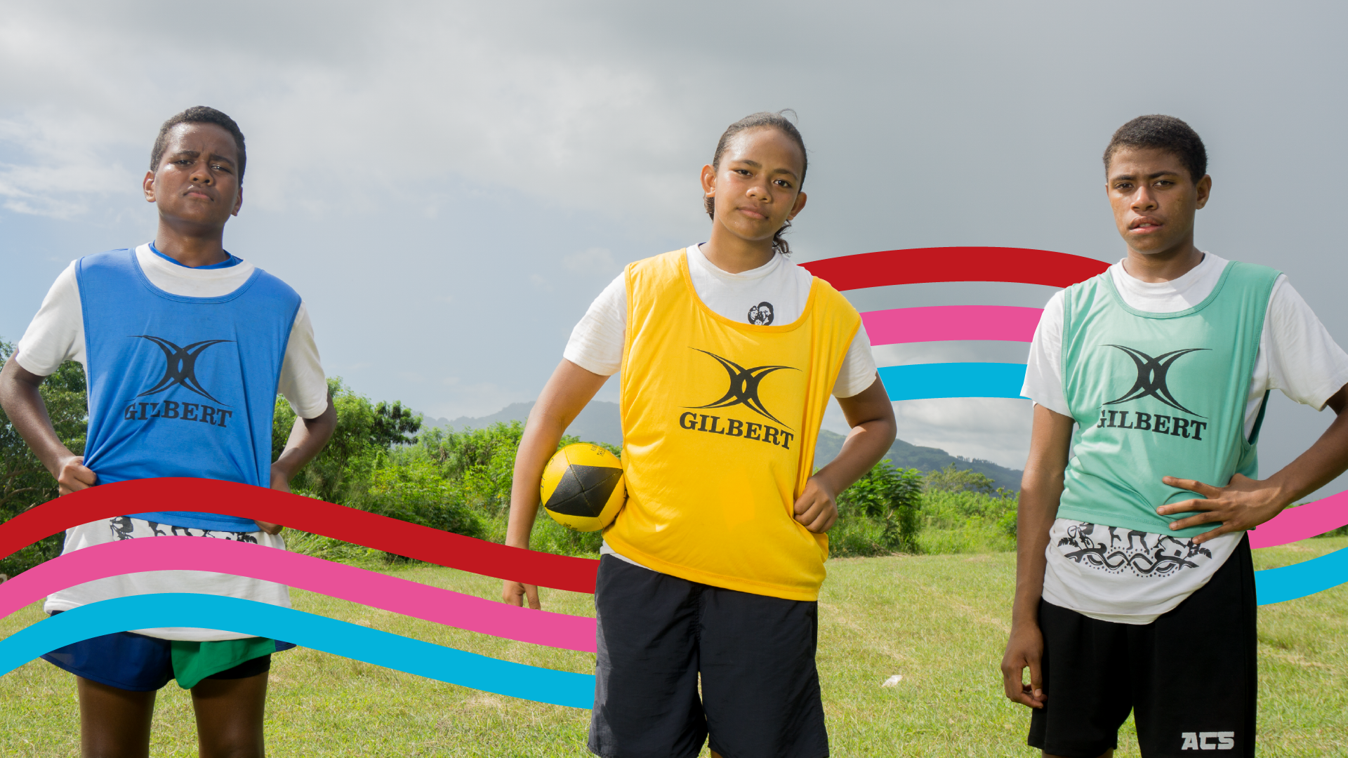
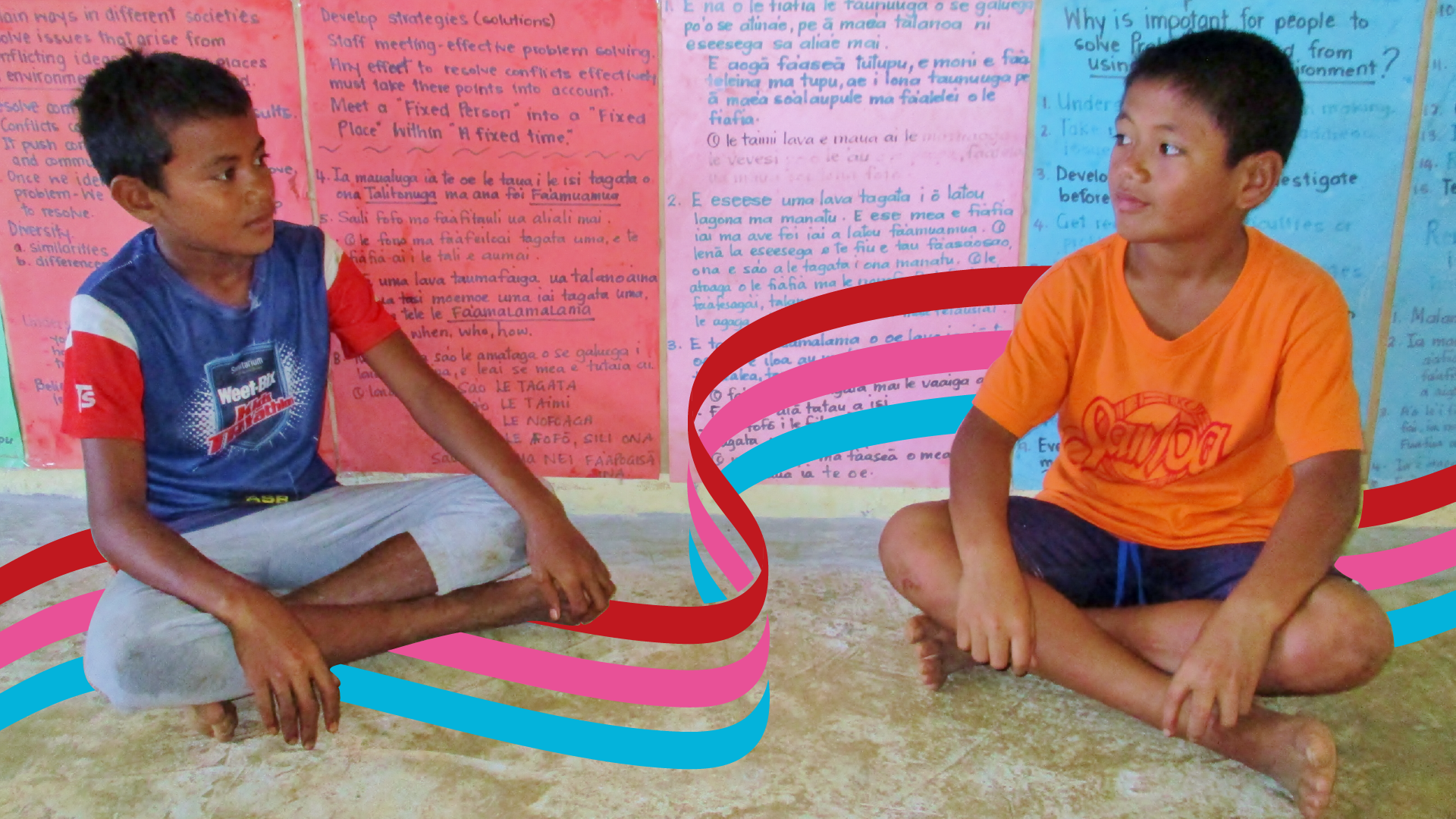
THREE LINES, THREE OUTCOMES
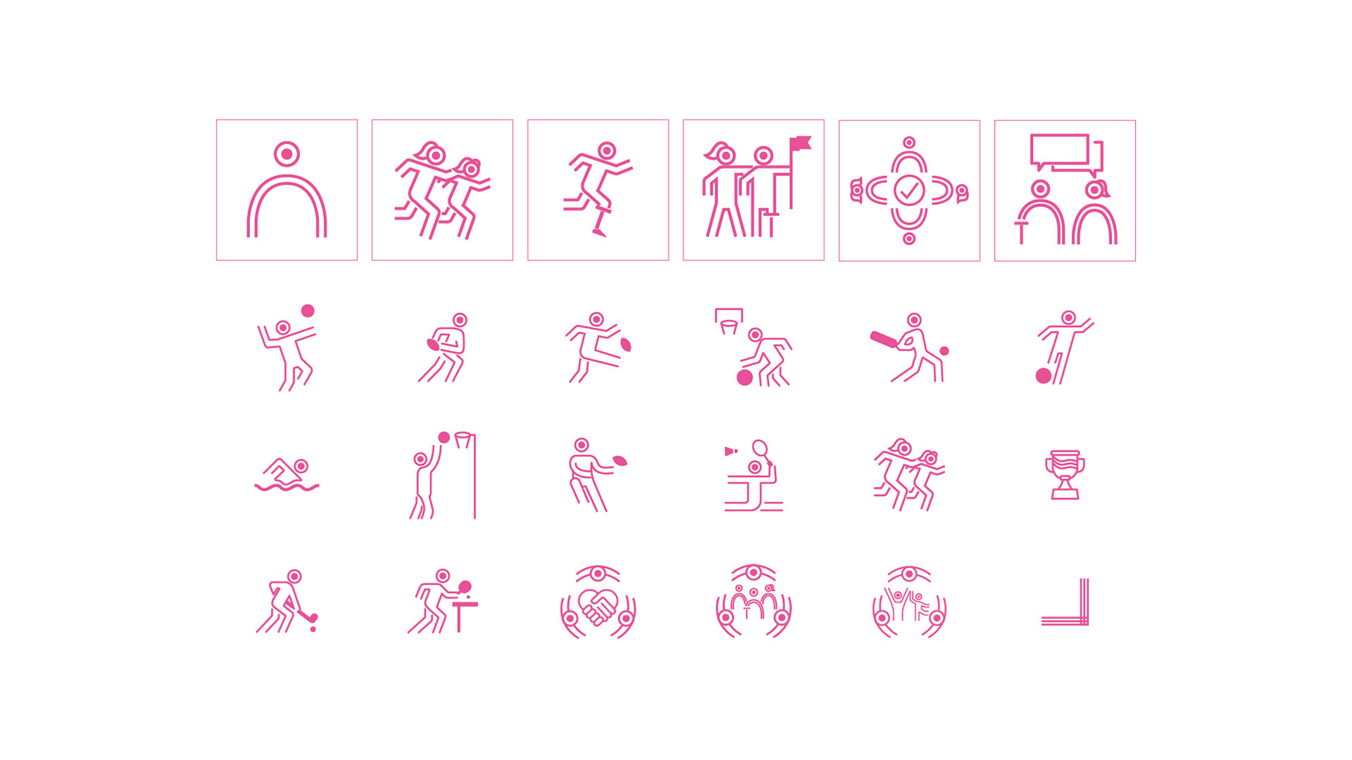
Team Up is the new phase of Australia’s sport for development program in the Asia-Pacific. Superseding the previous Pacific Sports Partnerships program, Team Up comes with its own visual identity, which is already being embraced by the 31 programs across the region who are part of our team.
The Team Up logo comprises the initials of our program name formed by three lines, each of which represents one of our three end-of-program outcomes:
1. Sport programs attract and retain women, girls and people with a disability, as well as men and boys
2. Sport organisations are safe, inclusive and accessible
3. Australia and Asia-Pacific partners use sport to strengthen relationships and build closer collaboration
These three outcomes contribute to Team Up’s overall goal: Australia-Asia-Pacific sport partnerships support people in realising their full potential through sport.
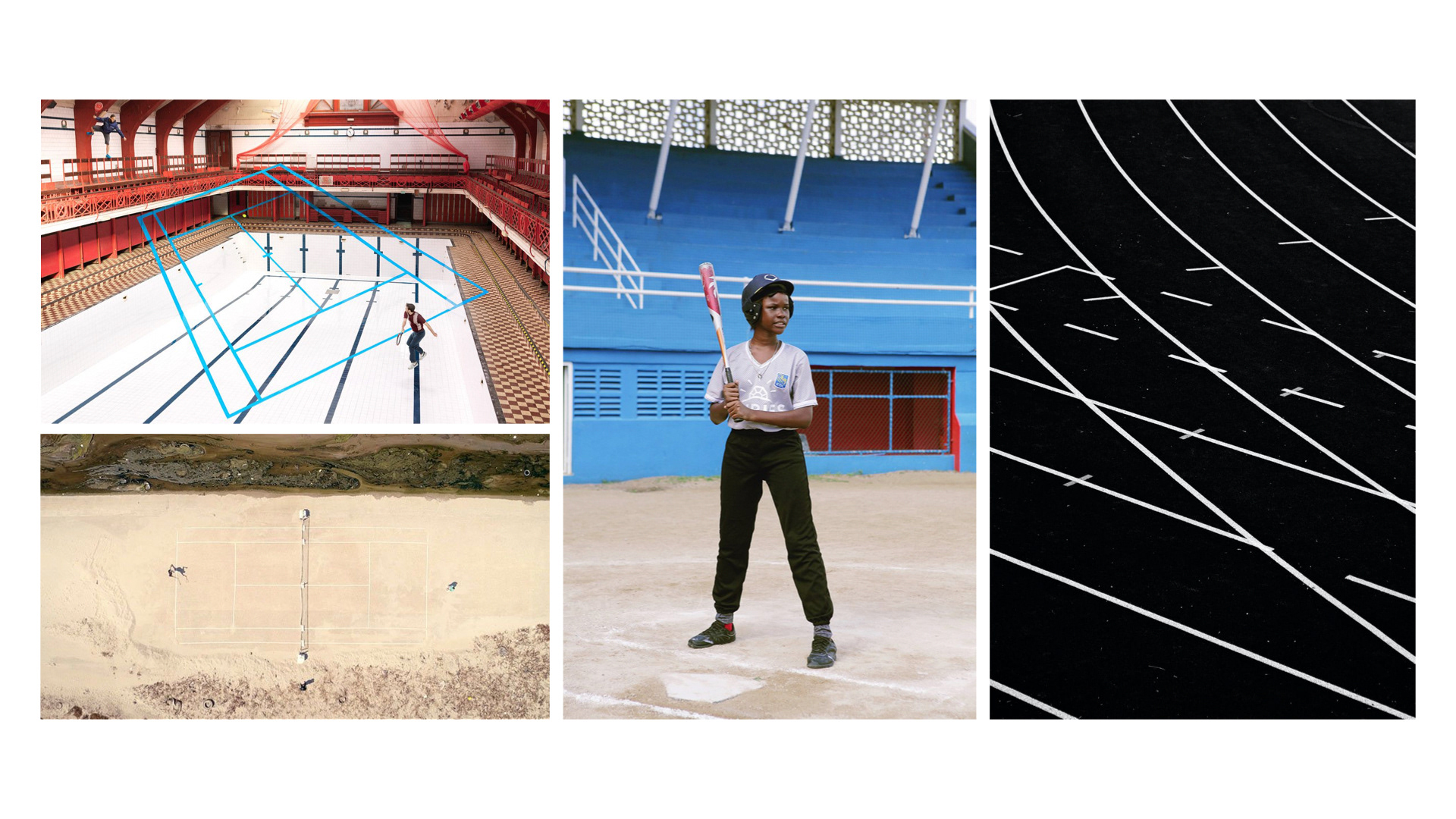
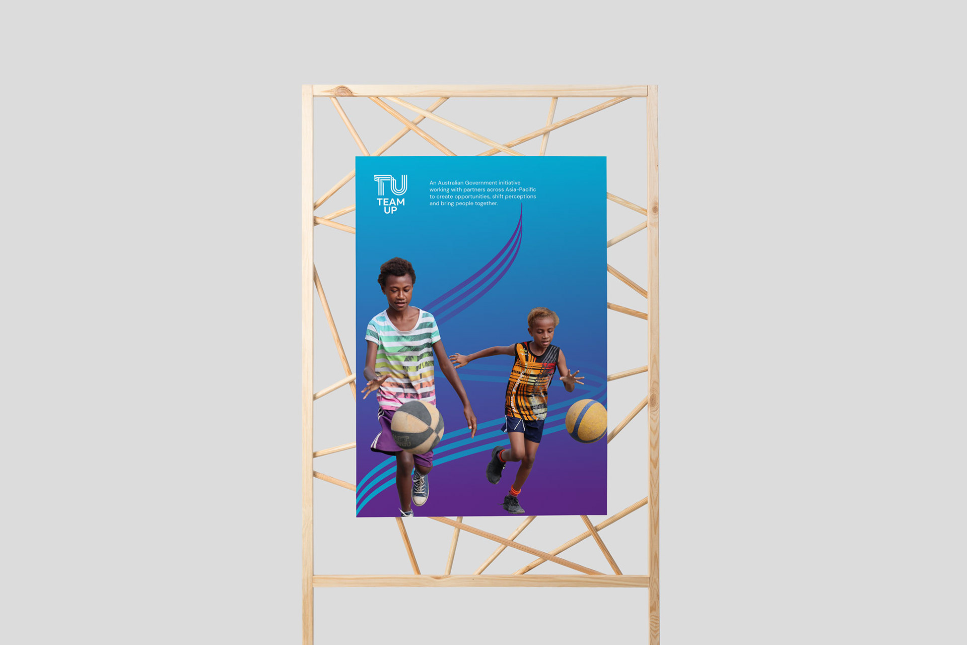
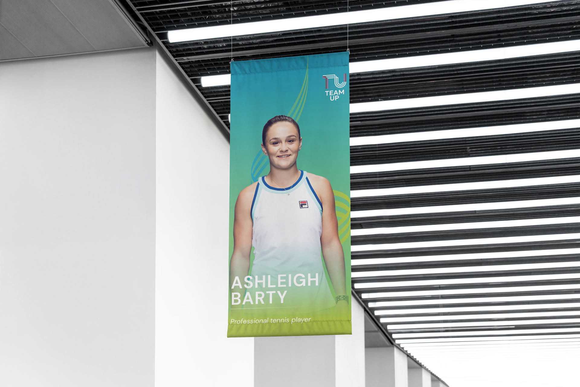
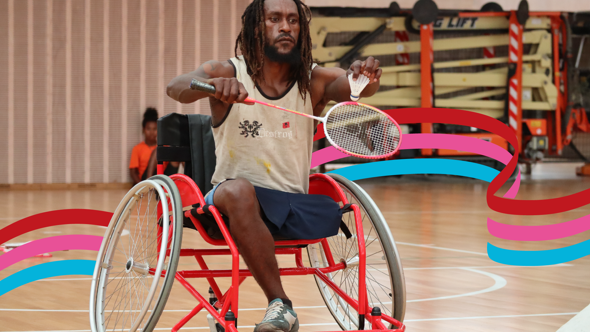
The line-based design of the Team Up logo was inspired by the lines found marking sporting venues such as fields, tracks, courts and pools.
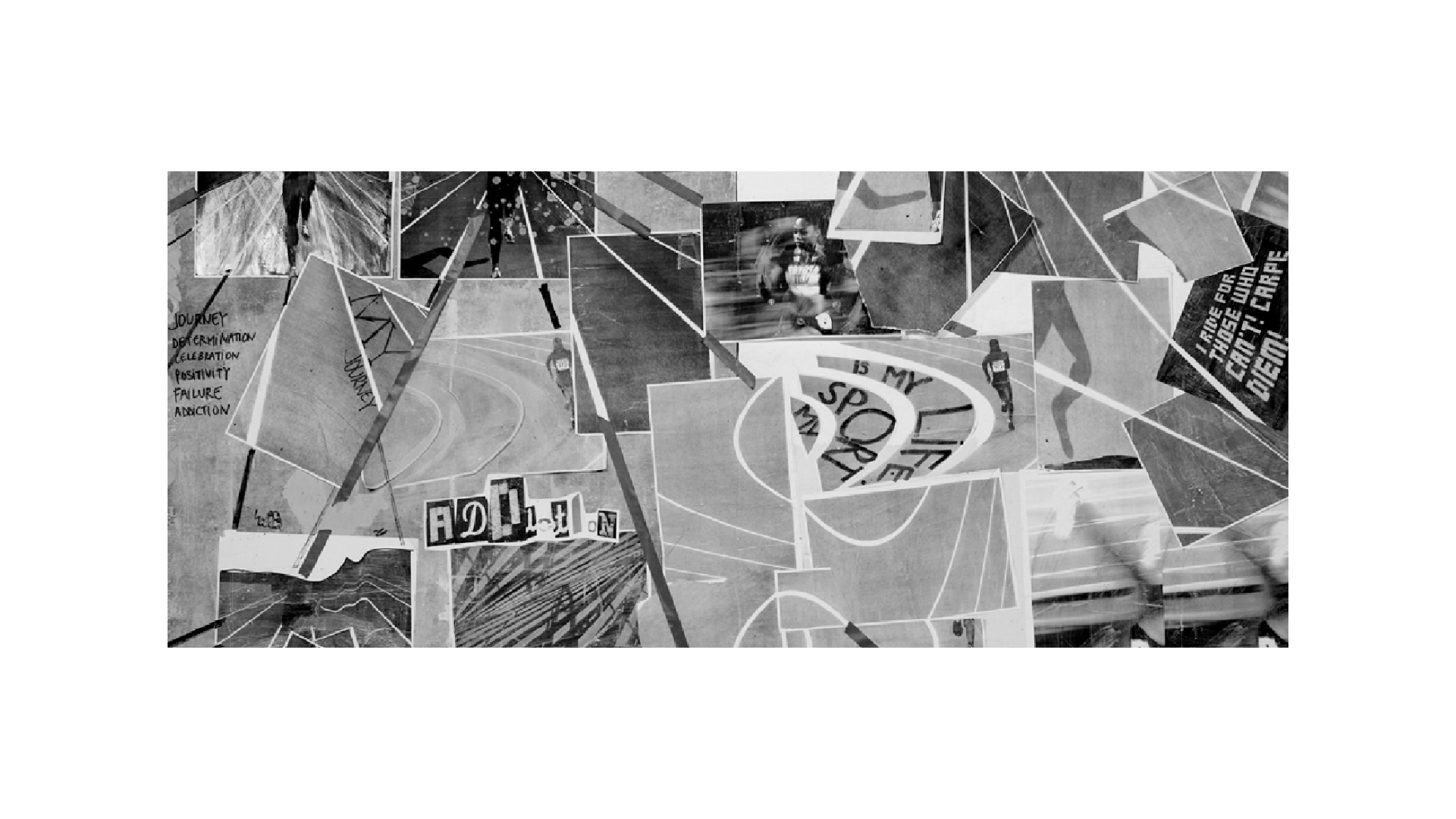
My starting point for the logo design was to look for images that represented the collective activity of sport. Before long, I had a collection of aerial images of sports fields, basketball courts and running tracks in front of me, and I began to see how they were all defined by lines. Even swimming pools have lines.
The lines felt strong, and powerful. They gave the spaces energy. And they gave the people using the spaces direction and momentum. So, I started working with lines in the logo design, to show how sport helps us all move forward together.
This movement is represented by the fluidity of the lines as they twist and turn, symbolising the dynamism of sport and the interaction of our program outcomes with each other, through the work of our partners.
The coloured elements at the beginning and ends of the lines reflect how Team Up programs are carefully co-designed (by implementing partner organisations and specialists from Team Up) with specific inputs leading to identified outcomes.
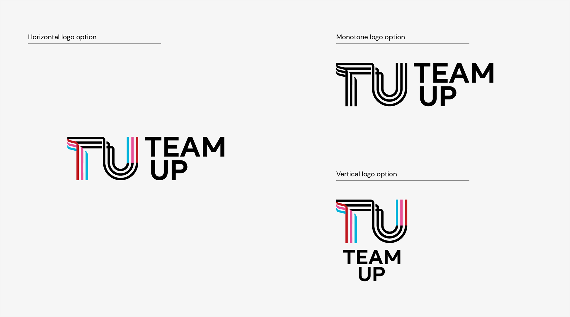

The Team Up colour palette is as bold and fun as our program. It is based on three primary colours, which also correspond to our three end-of-program outcomes:
Red: Sports programs attract and retain women, girls and people with a disability, as well as men and boys.
Pink: Sports organisations are safe, inclusive and accessible.
Blue: Australia and Asia-Pacific partners use sport to strengthen relationships and build closer collaboration.
In addition to our three primary colours, we also have three secondary colours – dark purple, vibrant orange and vibrant green – that appear in our colour gradients and other branding assets.
Our program management team developed The Team Up brand in collaboration with our partners and others who work in the sports sector across the Asia-Pacific and Australia.
A market research project in 2020 sought feedback on options for our program name and logo, and Team Up enjoyed strong support from respondents in the Pacific, Asia and Australia.